Citizen Lab at the EU Hackathon
A couple of weeks ago I had the privilege of attending the EU Hackathon in Brussels, Belgium as a representative of the Citizen Lab and OpenNet Initiative. Developers from 17 different countries had 23 hours to create projects meant to raise awareness of issues regarding Internet quality, censorship, and transparency. The target audience was both average Internet users and policymakers.
The teams (and some solo participants) were competing for two €5000 prizes – one for the Internet quality track, which focused on visualizing M-Lab data and/or integrating their tools into applications that help users to better understand the nature of their broadband connections. The other track was for Global Transparency, using data from ONI, Herdict, Google’s Transparency Report, and anything else that could help illustrate the consequences of and barriers to the free flow of information online.
I was amazed by what everyone was able to come up with in such a short amount of time, and the creativity that went into the entries. Not to mention their dedication – though many participants went back to the hotel for at least some sleep, others worked straight through the night, only taking short breaks to eat, guzzle energy drinks, and take advantage of Google office perks like the foosball table, automatic massage chair and immersive 8-screen Google Earth station. I was part of the jury, along with EU regulators and reps from Google, M-Lab, and Herdict. It was hard to choose clear winners, but in the end I think the teams we settled on were very deserving. I’ve written up brief descriptions and some impressions of a few of the projects below. Please note these are my views alone, and do not necessarily reflect those of other jury members.
Internet Quality Track
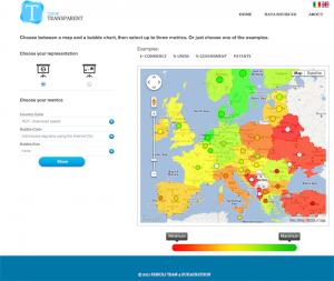
For the Internet Quality track, Team Ferioli won with their Google Maps-based project that allows users to compare NDT data to various economic indicators pulled from Eurostat. Countries are coloured based on NDT metrics, and then bubbles may be overlaid on the map, encoding the Eurostat indicators as colour and/or size.
This makes it possible to display up to four data dimensions in a single map view. I’m not a huge fan of using bubble sizes in this way, or cramming too much information into a single visualization, so I was pleased that Team Ferioli’s tool doesn’t force you to specify a metric for bubble size. By simply overlaying coloured bubbles on the map, it’s really easy to pick out interesting discrepancies. For example, Romania apparently has high transfer speeds despite having a relatively low percentage of regular Internet users, whereas it’s the opposite in Slovakia.
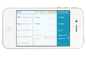
Second place for the Internet Quality track went to Team Maggi, who created separate mobile and desktop applications that allow non-technical users to run NDT tests and then see the data. Their visualizations were clean and intuitive:
(See this page for more screenshots.) I liked that it was easy to immediately compare test results to other countries’ averages.
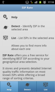
Third place went to Team Artimon from Romania. What I found most compelling was their use case:
The idea of the application started with some real problems that a lot of users are facing with their ISP’s. A lot of them are claiming to provide a certain service quality, but after you subscribe to them you will find otherwise. Also in a lot of places around the city you don’t really know what your ISP options are, since asking some ISP’s to tell you if they provide the service in that area might take them up to one week to investigate and answer you.
So we created a service and an application that are called “ISP Rate” and that would increase the transparency between the real services provided by ISP’s in order to increase competitiveness in the end-user’s benefit.
Their tool looks easy to use, and I hope it will be an effective way for users all over the world to improve their Internet connectivity.
There were several other worthy entries on this track. I can’t summarize them all, but I would like to highlight two others.
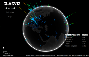
Glasvis, by Tony Blank, uses the cutting-edge WebGL Globe platform to visualize Glasnost data. The initial visualizations he put together of how ISPs throttle traffic such as BitTorrent look really cool, but more impressive to me is the amount of effort Tony put into the back-end so it can be used as a platform for other visualizations and analysis tools. I’m looking forward to seeing what else can be built upon it. Play around with Glasviz here (requires Chrome).
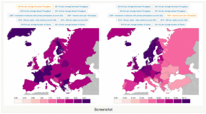
The other project I’d like to discuss is Ananke, by Eduardo Graells Garrido:
Eduardo has an obvious awareness of data visualization fundamentals and best practices, and for the hackathon he developed a working prototype as well as two mockups of interactive visualizations meant to support data exploration and decision making. Like Team Ferioli’s entry the prototype incorporates economic indicators, displaying World Bank statistics alongside M-Lab data. The difference (aside from data source) is how comparisons are made. Instead of placing a bubble over each country on a single map, two map views are displayed in parallel, a user-selectable variable displayed on each. The different approaches have different strengths. The single map with bubbles makes discrepancies such as those described above stand out and be found more quickly, and doesn’t require moving your eyes back and forth between maps. On the other hand, I find it easier to spot geographic trends within individual variables with Eduardo’s approach, without the bubbles disrupting the visual flow. Also, props to Eduardo for choosing a colorblind-friendly colour palette. I don’t know whether it was a conscious decision but it is an important consideration, often overlooked by visualization developers (including Team Ferioli).
Eduardo’s mockups have some interesting ideas behind them, but need a bit more refinement. His Internet quality dashboard displays several metrics for a particular country and is meant to be interactive, allowing comparisons to be made across ISPs at various points in time. I like the small multiples approach, but the bar charts as currently envisioned don’t make a lot of sense as they compare variables that have entirely different units. The final component of Eduardo’s submission was a mockup meant to show correlation between real-world events and Internet quality metrics, which I find intriguing and have spent some time thinking about as well. I would have found his example a bit more compelling if there was real data behind it, as opposed to the “Interesting Query” placeholders. Overall I really liked Eduardo’s submission and I’d love to see further work done with it.
Global Transparency Track
The winner of the Global Transparency track was a game called Beat the Censor, which is “about understanding the basic principles of internet censorship and how to circumvent it.” I thought it was a creative idea and very well executed, educating the player about censorship in a natural way as they try to connect users in various countries to websites that may or may not be filtered there, based on Herdict’s data. The people behind it, “UN Team,” are a great bunch of guys and they had interesting ideas for further development, such as including intermediate circumvention or proxy nodes to connect users to blocked sites.
Second place was another game, an Internet transparency quiz by Niels Rasmussen, a simple yet effective way to educate people about transparency and Internet filtering.
Third place was won by Team Indigeni Digitali for their Sharpnodes visualization, which displays a user-selected URL and countries in an interactive node-link diagram that allows the user to drill down into the underlying data.
A couple shout-outs for some other projects I liked in this track: Team Fisk created a mashup that used the ONI and Google data along with real-time usage data from a circumvention tool they’re working on, which I thought was an interesting idea. I also liked that Team Bryk‘s entry showed additional information about countries such as population and Internet penetration alongside filtering and transparency data, and that they put quite a bit of effort into building their tool as something that can be used by other developers.
For other hackathon coverage, check out Ryan’s post at Herdict and the official EUhackathon video.
